
“A name carries history. A logo carries identity. Together, they carry everything a team wants you to remember.” – Unknown
Every team on the current Formula 1 grid carries a name and a logo that tells a story. Sometimes it’s a story of corporate identity. Sometimes it’s a story of personal legacy. And occasionally it’s a story so layered with history that the current name barely hints at everything that came before it. Understanding where these names and logos came from adds a dimension to watching the sport that the racing alone doesn’t provide.
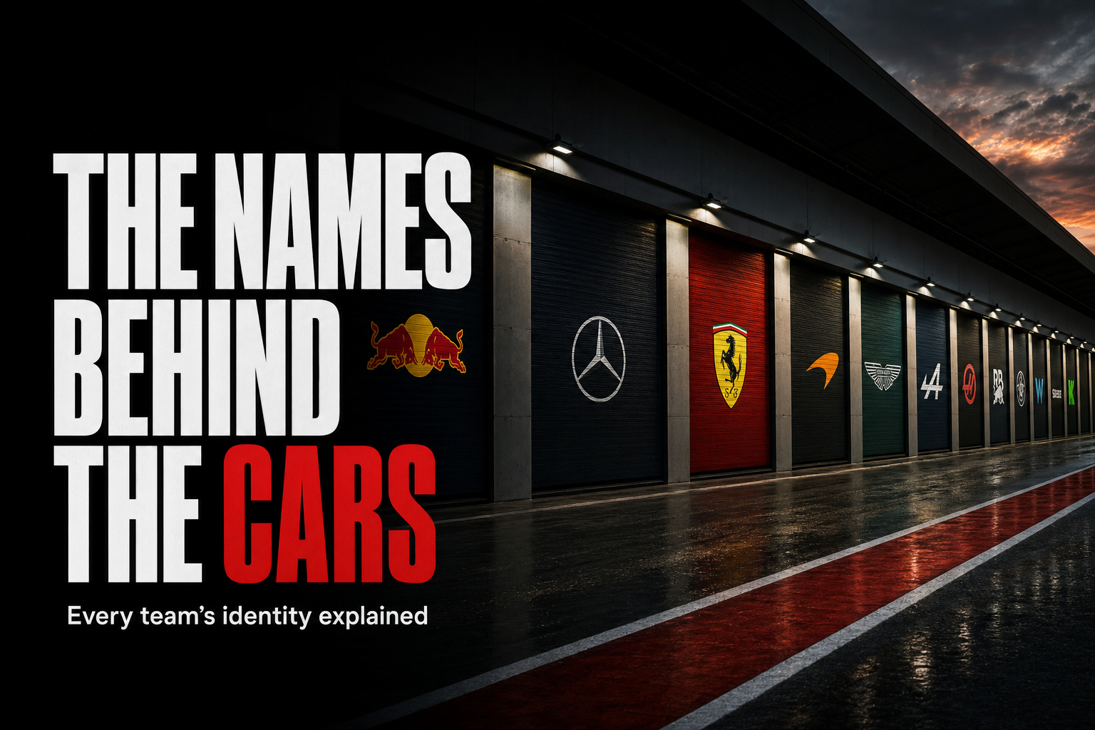
Here is the story behind the identity of every team on the 2026 grid, grouped by the kind of story they tell.
The Manufacturer Names
Ferrari, Mercedes, McLaren and Aston Martin carry names tied directly to founders or to automotive heritage that predates Formula 1 itself. These are the teams whose identities feel almost geological. They were here before most fans watching today were born and they’ll likely outlast whatever happens in the next decade of the sport.
Ferrari
Ferrari’s prancing horse, the Cavallino Rampante, was the personal emblem of Francesco Baracca, an Italian First World War flying ace. Enzo Ferrari adopted it with the blessing of Baracca’s mother and it has appeared on every Ferrari since. The yellow background on the badge represents the city of Modena, where the company was founded. That’s a logo with roots in a world war. Every time Charles Leclerc drives out of the pit lane at Monza, he’s carrying that history on the nose of his car.
Mercedes
The three-pointed star represents the company’s ambition for domination on land, sea and air. It predates Formula 1 by decades and has remained essentially unchanged through every era of the team’s involvement in the sport, including the Brawn GP transition that brought Mercedes back as a full constructor in 2010. The logo didn’t change when the team did. That’s how embedded it is.
McLaren
Bruce McLaren was a New Zealand driver and engineer who founded the team in 1963. He died testing a Can-Am car at Goodwood in 1970, but the team he built kept racing. The papaya orange that defines the current livery is a deliberate revival of McLaren’s original racing colour from the 1960s, reintroduced as the team rebuilt its identity around its founding heritage. It’s one of the more thoughtful rebranding decisions in recent F1 history. Lando Norris and Oscar Piastri now race in a colour that Bruce McLaren chose before either of them was born.
Aston Martin
The winged badge comes from the British road car manufacturer whose history in motorsport long predates its current Formula 1 involvement. The team’s current identity represents the marriage of that historic badge with Lawrence Stroll’s modern investment programme. Fernando Alonso joined the team in 2023 partly because of what that badge represents. The history was part of the pitch.
The Energy Drink Identity
Red Bull’s name and logo require no real explanation to anyone who has seen the energy drink. The bull logo, two bulls charging toward a yellow sun, has remained consistent since the brand’s earliest marketing. The team’s full title, Oracle Red Bull Racing, reflects the layered sponsorship arrangements that define modern F1 naming conventions. The core identity has never wavered though. It’s always been the bulls. Max Verstappen has driven under that logo for his entire Formula 1 career and it’s become as associated with him as it is with the drink itself.
The Teams Shaped by Transition
Several teams on the current grid carry names that represent the most recent chapter of a much longer and more complicated history. These are the identities that require the most unpacking.
Audi
Audi Revolut‘s entry as a full factory team in 2026 represents the culmination of a journey that ran through Sauber, Alfa Romeo and BMW Sauber before arriving at its current identity. The four interlocking rings of the Audi logo represent the four companies, Audi, DKW, Horch and Wanderer, that merged to form Auto Union in 1932. Modern Audi descends directly from that merger. So when Nico Hulkenberg and Gabriel Bortoleto line up on the grid in 2026, they’re carrying a logo whose meaning goes back nearly a century before they were born.
Cadillac
Cadillac’s entry as the eleventh team in 2026 brought General Motors’ century-old crest to Formula 1 for the first time. The heraldic design dates back to the company’s founding and represents one of the oldest brand identities in American industry. There’s something genuinely unusual about seeing a logo that old arrive on an F1 grid for the first time. Most historic badges in this sport have been here for decades. Cadillac’s is historic in a completely different context.
Alpine
Alpine, the Renault-owned team, carries the name of Renault’s sports car division. The Alpine name itself comes from the French Alps, where the original Alpine cars were tested and developed on demanding mountain roads. It’s a name with a specific geography attached to it, which makes it more interesting than a lot of corporate rebrandings. Pierre Gasly and Esteban Ocon have both raced under that banner, two French drivers for a team with a deeply French identity.
Racing Bulls
The Racing Bulls have gone through more name changes than any other team on the current grid, from Minardi to Red Bull’s junior outfit to Toro Rosso to AlphaTauri to their current identity. Each name change reflected a shift in ownership or sponsorship priorities. The team’s core function, developing young Red Bull drivers, has remained constant throughout. Liam Lawson and Arvid Lindblad carry that tradition forward in 2026.
The Independent Spirits
Not every team on the grid arrived via a manufacturer programme or a corporate rebrand. Some are here because one person decided to go racing.
Williams
Williams Racing carries the name of its founder, Frank Williams. The team’s logo has remained relatively simple and understated throughout its history, reflecting an identity built around racing pedigree rather than corporate branding. Williams won seven constructors’ championships. The name alone carries that weight. No elaborate badge required.
Haas
Haas joined the grid in 2016 and carries the name of Gene Haas, the founder of Haas Automation, the machine tool company that backs the team. The logo reflects that industrial heritage directly. It’s a contrast to the more elaborate branding of teams with longer motorsport histories. There’s no mythology attached to it. It’s a businessman’s name on a racing car and the team has made no attempt to dress that up as something else. Oliver Bearman and Esteban Ocon race for Haas in 2026 as the team continues to build its own identity from scratch.
What the Names Actually Tell Us
Step back from the individual stories and a pattern emerges. The teams whose names and logos carry the deepest history, Ferrari, Mercedes, McLaren, tend to be the teams whose identity feels most permanent regardless of who owns them or how their fortunes change from season to season. You could strip the livery off a Ferrari and most fans would still know what it was.
The teams whose identities are tied to corporate sponsors or recent restructuring exist in a state of relative flux that history-rich teams don’t experience in the same way. That’s not a criticism. Cadillac’s American crest and Audi’s four rings give the sport its sense of ongoing relevance. New names on the grid mean the sport is still growing. Both kinds of identity matter.
Every name on the grid is a small piece of a much larger story. Recognising that story adds something to watching the cars carry those names around a circuit at 300 kilometres per hour. The badge on the nose isn’t decoration. It’s the shortest possible version of everything the team has been.
Further reading
- Ferrari Official Website — Primary source for Ferrari’s official brand history including the Cavallino Rampante and its origins.
- Audi Brand History — Official Audi source explaining the four rings logo and the Auto Union merger history referenced in the article.
Related picks on Amazon
A few things worth a look if this article got you curious. Links are affiliate: buying through them supports the site at no extra cost to you.
- Formula 1: The Official History (hardcover) — shop on Amazon
- F1 team diecast model car collection — shop on Amazon
- Enzo Ferrari biography — shop on Amazon
